7 Resume Fonts That Make a Great First Impression
Readable. Polished. Designed to Get You Noticed.
Your resume has exactly six seconds to make an impression — and that’s if the recruiter’s had their coffee. So while your skills matter, the font you use? Yeah, it plays a bigger role than you think.
You don’t need anything flashy. You need clarity, structure, and a touch of style — the kind of typeface that says “I’m professional, I pay attention to detail, and yes, I’m hire-worthy.”
We’ve curated 7 fonts that strike the perfect balance between modern and timeless. Fonts that are clean on the eyes, ATS-friendly, and make your resume feel like it came from someone who gets it.
Because sometimes the first step to getting the job… is just being readable.
What’s the Best Font To Use for a Resume?
Let’s not overthink it — the best resume font is the one that doesn’t make the recruiter work.
You’re not trying to win a design award here. You’re trying to get hired. So forget the fancy swirls or hyper-stylized fonts — your goal is simple: make it easy to read, professional, and clean.
Here’s what actually matters when choosing a font:
Readable: If someone has to zoom in or re-read a line, it’s a red flag. Your font should be simple and smooth. No weird curls, no overcrowded letters. It should feel natural to the eyes, even on a rushed scroll.
Easy to See: Some fonts look great on a retina screen but vanish when printed or viewed in grayscale. Pick something with enough weight — not too thin, not too bold — so it stands out even when the printer betrays you.
Simple and No Drama: Keep it basic. Fonts with strange proportions, slanted characters, or decorative gimmicks do more harm than good. This isn’t the place to “be different.” Let your work stand out — not the font.
What About Vibes?
Yes, fonts have vibes.
- Serif fonts = reliable, traditional, trustworthy.
- Sans-serif fonts = modern, clean, approachable.
Pick based on your industry and tone. Finance? Law? Go serif. Design, tech, or marketing? Sans-serif is your friend.
Best Resume Fonts to Use in 2026
Here’s our handpicked list to make your resume look sharp and smart — without trying too hard:
Myron Serif Font

Classy with just the right amount of edge. Myron gives your resume that elevated, editorial feel — like you’ve got taste and you know what you’re doing. Perfect for standing out without shouting.
Wensley Modern Serif Font Family
Minimal meets refined. Wensley blends traditional serif elegance with a modern layout, making it ideal for professional resumes where balance and clarity are everything.
Afrah Serif Font Family

Afrah is that quiet overachiever. Clean, graceful, and built to impress — it gives your resume a polished, high-end vibe while staying incredibly readable.
Abiah Sans Serif Font Family

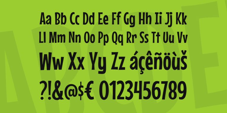
Structured, strong, and sleek. Abiah is a modern sans that instantly makes your resume feel organized and confident. Ideal for tech, design, or anything where clarity wins.
Aaliyah Serif Typeface

Delicate yet professional. Aaliyah brings in soft curves with firm structure, making it a great pick for resumes that want a little creative personality without losing credibility.
Abed Serif Font Family

Bold, academic, and confident — Abed feels like the typeface you’d find in serious publications. If you want your resume to feel grounded and intelligent, this one’s your guy.
Wildrin Serif Old English Font

A curveball — but hear me out. Wildrin is a vintage-inspired serif with just enough flair to stand out in headers or name sections. Use it sparingly for that touch of originality. Not for body text, but brilliant when used right.
Fonts You Should Avoid on Resumes
Fonts say a lot — sometimes more than you want them to. While you might be tempted to “stand out,” using the wrong font can make your resume feel unprofessional, hard to read, or just straight-up unserious.
Here are the types of fonts you should leave out:
Casual Fonts
Think Comic Sans or anything that looks like it belongs on a kid’s birthday card. Too playful = not the vibe.
Polarizing Fonts
Fonts like Papyrus might look cool to you, but they come with baggage. Strong opinions. Bad branding. Just not worth the risk on something as important as a resume.
Script Fonts
They’re elegant, sure — but hard to read at a glance. And on printouts, those thin strokes? Gone. Leave script fonts for wedding invites.
Handwriting Fonts
Fonts that mimic real handwriting can feel too informal or messy. If your name looks like it was written with a crayon, you’ve already lost the room.
Graphic or Decorative Fonts
Any font with icons, flourishes, or cartoon-like characters is a no-go. You’re applying for a job, not designing a cereal box.
Final Thoughts
Font choice might seem small, but it sets the tone before you say a word. A clean, readable font shows you care about presentation, clarity, and professionalism — which is exactly what hiring managers want to see.
Keep it simple. Keep it sharp. Let your work do the rest.