What Font Pairings on Canva Say About Your Brand’s Personality
Fonts do more than decorate your designs. They dictate how people think about your brand. Whether you’re creating a business logo, a social media post, or a flyer, the fonts you choose send a clear message.
Canva makes font pairing accessible, but using it effectively still requires a clear understanding of brand tone and visual balance. You must know how fonts work together and how they reflect your brand’s tone. Making the right choice builds trust.
Making the wrong one can confuse your audience. Here’s what you need to know about how font pairings shape your brand personality before you hit “publish” on your next design.
Font Pairing Psychology: What You Feel Is What You Read
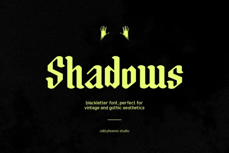
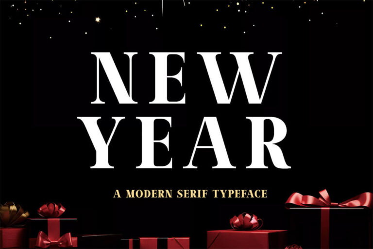
Each font style creates a different feeling. Serif fonts, like Times New Roman or Playfair Display, often feel serious and classic. Sans-serif fonts, such as Montserrat or Open Sans, feel clean and modern.
When paired correctly, fonts create balance and improve readability. But when mismatched, they cause friction. This makes it harder for readers to trust the message. New research using advanced neuroscience tools shows that visual elements significantly impact attention and memory.
Logos with distinct, dynamic features, for instance, were much better at grabbing and holding attention and improving recall. This study, published in MDPI Journals, used AI-powered eye tracking, EEG technology measuring brain activity, and implicit memory tests to predict human responses.
The researchers tested three different logo designs. They found that dynamic elements, recognizable icons, performed best in influencing consumer perception and interaction. These insights highlight how design and font pairing can affect not just what people see, but how they feel and what they remember.
For example, if a legal service uses a playful font like Comic Sans, it sends a confusing signal. Fonts must align with what your brand represents. Fonts act as emotional tools that influence how people react to your message. Choosing the right combination helps you tell your story in a way people understand and remember.
Canva as a Brand-Building Tool, Not Just a Design Platform
Many people use Canva because it makes design easy. But Canva is more than a template tool. It helps you shape your brand identity. Your brand is not just your logo or tagline. It’s the cumulative experience visitors have with your content. Fonts play a major role in that interaction.
Today, people expect brands to feel real and relatable across all platforms. A 2024 PowerReviews report found that 91% of shoppers look for customer visuals before making a purchase. They want to see what products look like in real life, not just polished marketing. This boosts their confidence and trust in a brand.
In contrast, when customer visuals are missing or hard to find, it can weaken trust and reduce the likelihood of purchase. Nearly a quarter of shoppers won’t purchase a product if there are no authentic visuals. Likewise, about 85% of consumers want to see genuine visual content on the product page.
That expectation for visual honesty applies to your designs, too. Your choice of fonts, layout, and imagery on Canva should reflect a tone that feels genuine and consistent. On Canva, the way you combine fonts should reflect your brand’s tone across all platforms.
If you use soft, rounded fonts for your Instagram posts but switch to sharp, bold fonts on your website, your brand can feel disjointed. Consistency builds recognition. Canva helps you do that without a design degree. But you still need to think carefully about what your font choices say.
When Good Design Masks Poor Intent
Design can help build trust, but it can also mislead. When used correctly, polished visuals can build confidence in your brand. But when design hides deeper problems, it becomes a risk.
This is how typography can be used to manipulate people’s feelings. When a brand uses calming fonts or soft colors, it can cause people to overlook serious issues. This marketing can lead to a false sense of security. This becomes even more serious when design distracts from real-world health risks.
One example is the vaginal mesh lawsuit, which involved medical products promoted with modern, trust-driven branding. Many people trusted the product because of its professional packaging and confident marketing. However, thousands of women later reported painful complications due to mesh erosion.
According to TorHoerman Law, the majority of the cases have been resolved, with the total settlement amount reaching nearly $8 billion. This case shows that visual design can’t be the only marker of trust.
Good fonts and layouts don’t mean a product is safe or reliable. As a designer, you should be mindful of how your designs shape emotions and decisions.
Fonts That Build Loyalty
Design is not only about grabbing attention. It’s about building long-term trust. The fonts you choose play a big role in that.
According to a 2024 Sprout Social study, nearly 65% of consumers feel more loyal to brands with which they have a connection. This strong connection doesn’t just drive loyalty; it influences buying decisions. Over three-quarters of consumers would pick a brand they connect with over a competitor, and 57% would spend more with that brand.
Fonts that feel overly aggressive or promotional can make your brand seem distant or less trustworthy. Fonts help you speak without saying a word. Handwritten-style fonts, for example, can make your brand feel warm and friendly. On the other hand, clean serif fonts can suggest stability and expertise.
According to a 2024 study published in The International Journal of Eurasia Social Sciences, typography also supports clear communication. It does so through font size, spacing, and layout, making reading messages easier. When used correctly, it builds a visual structure across headings, subheadings, and body text.
Additionally, it also helps shape brand identity and boosts emotional engagement by aligning design choices with audience expectations. When using Canva, test font pairings in real templates. Read the text out loud. Ask yourself if the tone feels right. If it doesn’t feel like your brand, it probably isn’t.
Commonly Asked Questions
1. How do I choose the best font pairing for my specific brand on Canva?
Start by defining your brand’s core identity: is it professional, playful, or innovative? Then, explore Canva’s vast font library, focusing on how each font feels. Experiment with contrasting styles for headlines and body text. Finally, test combinations to ensure they reflect your brand’s unique voice.
2. Why is font consistency important across platforms?
Consistent fonts build brand recognition and trust. When people see the same typeface style on your website, social media, and print materials, it reinforces your brand identity. Inconsistent fonts, on the other hand, can make your brand appear fragmented or unreliable, damaging its long-term credibility.
3. What are common mistakes to avoid when pairing fonts on Canva?
Avoid using excessive font styles in a single design. It creates visual clutter and confuses your audience. Do not pick fonts solely based on trends; prioritize those that align with your brand’s lasting identity. Also, be careful not to use overly stylish fonts for large text segments.
Fonts are more than just a design detail. They are a key part of how people understand and remember your brand. On Canva, you have access to hundreds of font options. But don’t rely on looks alone. Make sure the fonts you choose support your message and values. Clear font pairings show that you care about how you communicate. And that care builds trust, one design at a time.